
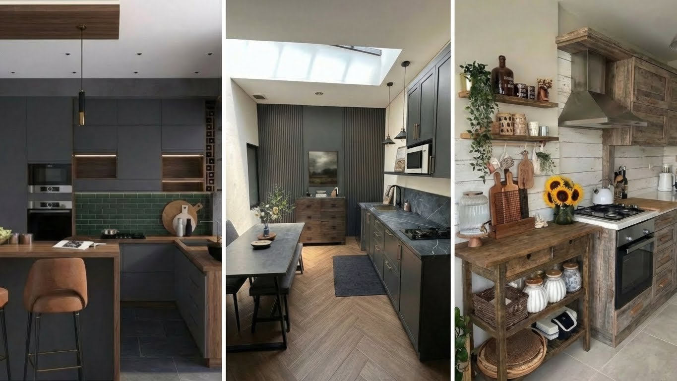
You want a cooking space that feels open and inviting, but your square footage says otherwise. This is a common frustration for homeowners and renters alike. Limited counter space and overflowing cabinets can make meal prep feel like a chore rather than a joy. The good news is that square footage does not dictate style or function.
Smart design choices can transform even the tiniest culinary corners into high-efficiency workspaces. By prioritizing layout flow, vertical storage, and visual tricks, you can create a room that feels twice as big. We have curated specific layouts that prove size is just a number. These designs focus on maximizing every inch while maintaining a high-end aesthetic. Get ready to turn your compact cook space into the heart of your home.
Key Takeaways
- Verticality is Crucial: Using wall space up to the ceiling draws the eye upward and doubles storage potential without occupying floor space.
- The Triangle Rule: Even in small layouts, maintaining the distance between the sink, stove, and fridge ensures a functional workflow.
- Light Palettes Expand Space: White, cream, and pale wood tones reflect natural light, blurring corners and making the room feel airy.
- Integrated Appliances: Hiding bulky appliances behind cabinetry panels creates a seamless visual line that reduces clutter.
- Multi-Functionality: Elements like fold-down tables or movable islands provide flexibility for dining and prep work in tight quarters.
Table of Contents
- Tiny Home with a Space-Optimized Kitchen Below the Loft
- Modern Single Wall Layout
- Compact Kitchen with Mini Dining Island
- Kitchen with Built-in Fridge Storage
- L-Shaped Kitchen with Built-In Appliances
- White Brick and Wood Interiors
- Space-Optimized U-Shaped Kitchen
- Kitchen with a Built-in Swing
- Traditional Single-Wall Layout
- Minimalist Kitchen Counter and Storage
- Kitchens with a Wall-Mounted Wooden Table
- Mid-Century Kitchen and Dining Area
- G-Shaped Kitchen
- Popular Asked Questions
- Conclusion
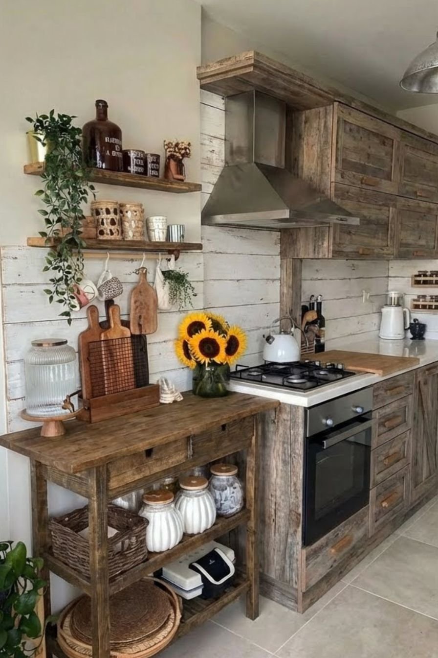
Tiny Home with a Space-Optimized Kitchen Below the Loft
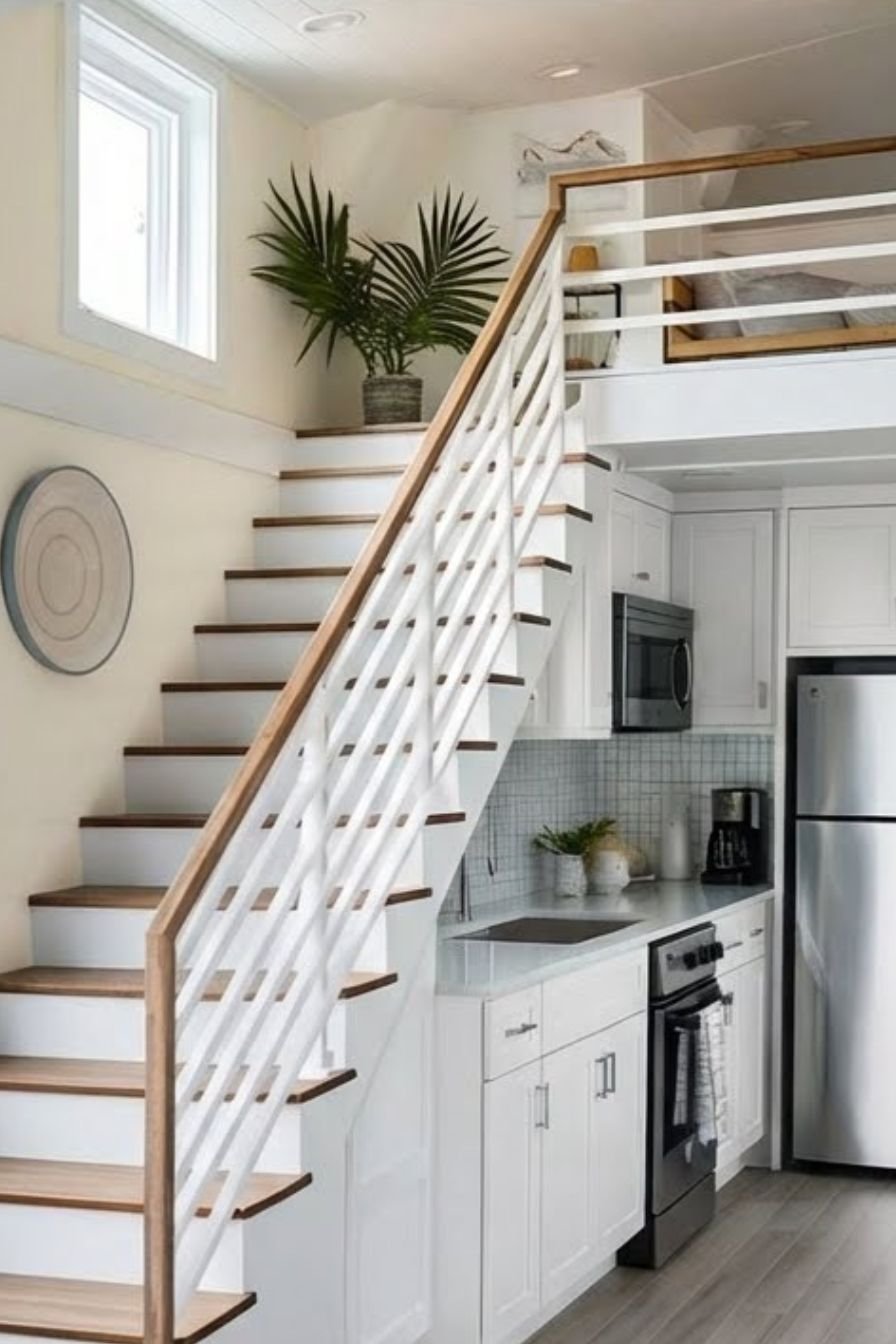
Tiny homes require the most ingenuity when it comes to kitchen design. Placing the kitchen directly beneath a lofted sleeping area utilizes vertical space that often goes wasted. This layout typically relies on custom cabinetry that fits snugly under the loft floor joists. The visual weight stays low, keeping the upper area open and airy. Light wood textures mixed with matte black hardware create a modern yet rustic appeal. The contrast prevents the space from feeling like a closet. You see this often in high-end RVs and accessory dwelling units where every millimeter counts.
Functionality here depends on compact appliances. A two-burner induction cooktop replaces a massive range, and a convection microwave serves as the oven. Deep drawers replace standard lower cabinets. Drawers allow you to pull contents out into the light rather than digging into dark recesses. This simple switch makes accessing pots and pans significantly easier. The area under the stairs leading to the loft often houses the pantry or a slide-out refrigerator. This integration keeps the main walkway clear for movement.
Pro Tip: Install LED strip lighting under the loft overhang to illuminate the workspace without needing bulky pendant fixtures.
Save this idea to your Pinterest.
Modern Single Wall Layout
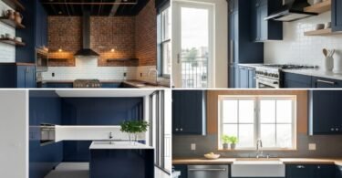
The single-wall layout is the ultimate solution for narrow apartments or open-concept studios. All cabinets, countertops, and appliances align along one wall. This linear approach frees up the rest of the room for a dining table or living area. A sleek, monochromatic color scheme works best here. High-gloss white or light grey cabinets reflect light and merge with the walls. This camouflage effect makes the kitchen appear to recede, giving the illusion of a larger living area. The absence of corners eliminates dead space often found in L-shaped or U-shaped designs.
To make this work, you must maximize vertical storage. Cabinets should extend all the way to the ceiling. The top shelves can hold seasonal items or serving platters used infrequently. Keep the backsplash simple. A continuous slab of quartz or large-format tiles creates less visual noise than intricate mosaics. Keeping the counter free of appliances is vital. Dedicate a cabinet garage for the toaster and coffee maker. When the counter is clear, the kitchen looks like a piece of built-in furniture rather than a utility zone.
Pro Tip: Use a movable kitchen cart on wheels to act as a temporary island when you need extra prep space.
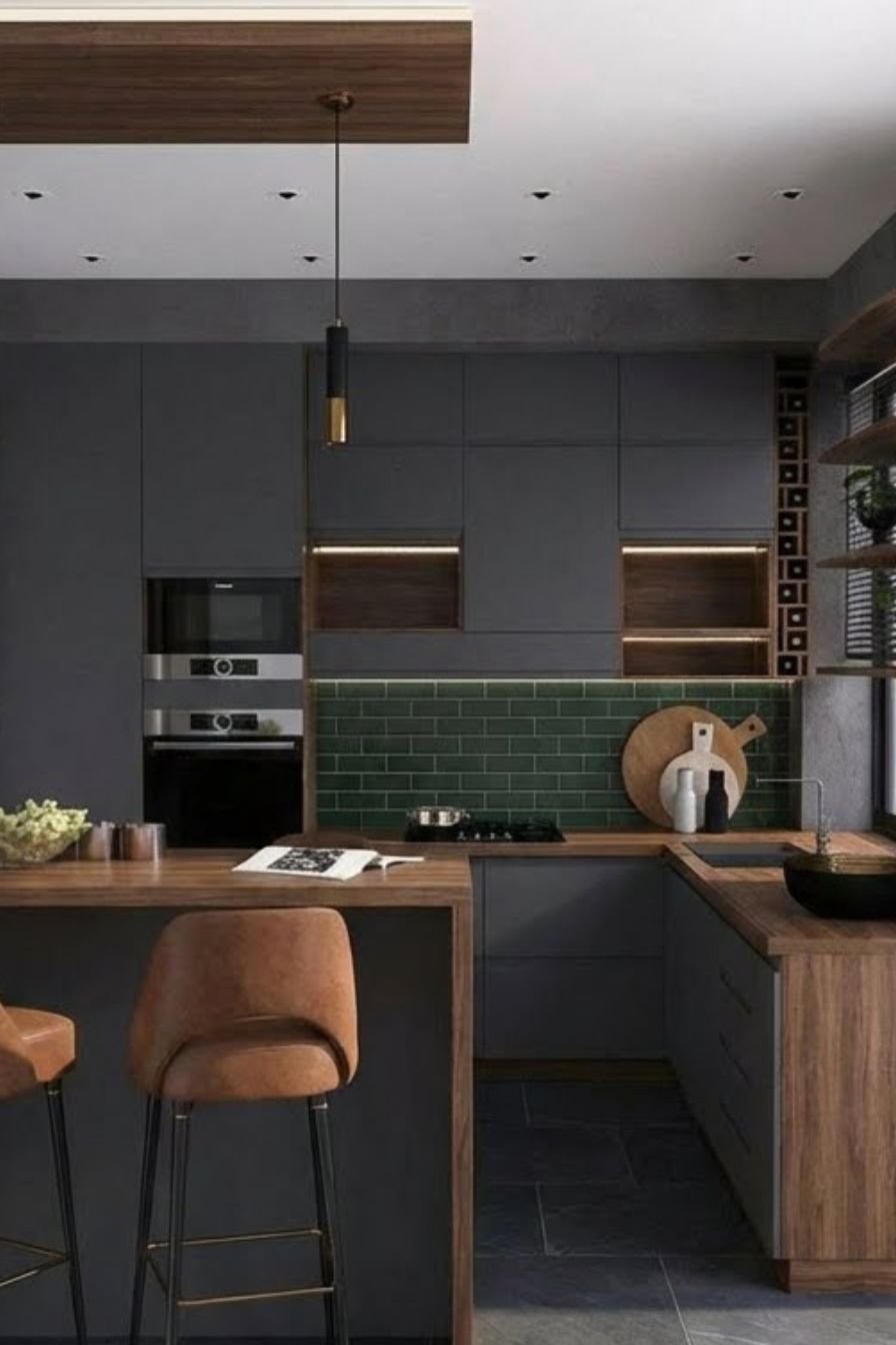
Compact Kitchen with Mini Dining Island
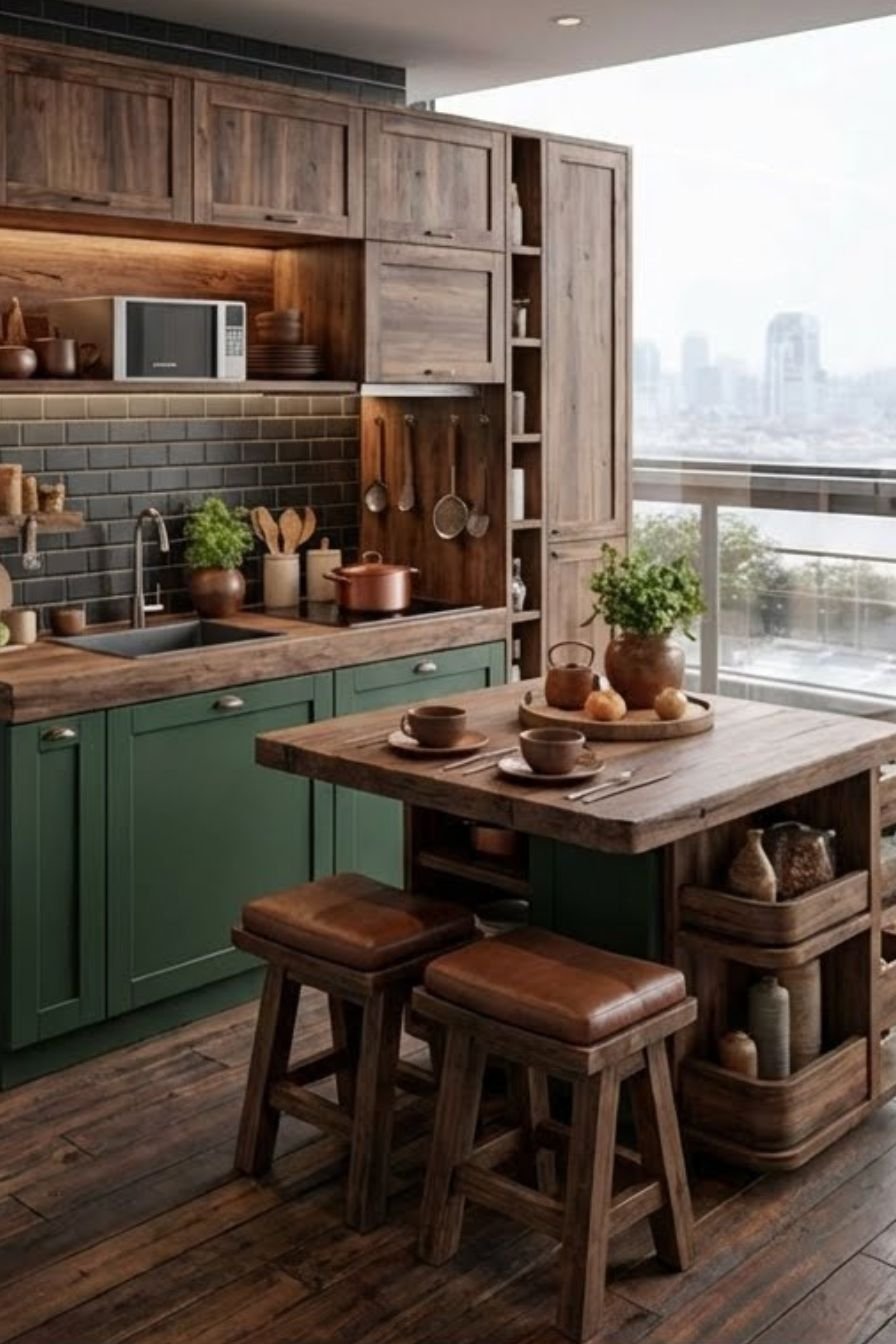
Merging the prep zone with the dining area saves massive amounts of floor space. A mini dining island serves as the room’s anchor. It functions as a chopping station during meal prep and transforms into a breakfast bar for eating. Visually, the island separates the kitchen from the living space without closing it off. Using a waterfall edge on the countertop—where the stone continues down the side—adds a touch of luxury and durability. Contrasting the island color with the main cabinets creates a focal point that distracts from the room’s small size.
The seating choice is critical for this layout. Backless stools slide completely under the overhang when not in use. This keeps the walkways clear. Storage is often built into the base of the island on the kitchen side. This is the perfect spot for trash bins, recycling, or oversized pots. Pendant lights hanging above the island define the vertical space and add warmth. The lighting acts as a visual cue that this small surface is a distinct, important zone.
Pro Tip: Choose an island with wheels and locking casters so you can push it against a wall during parties to open up the floor.
Kitchen with Built-in Fridge Storage
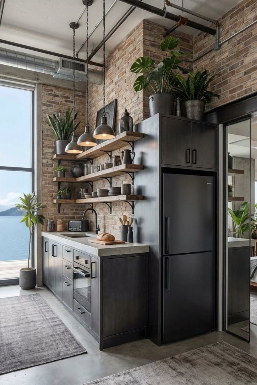
The refrigerator is often the bulkiest object in a small kitchen layout. It can protrude and disrupt traffic flow. A built-in fridge design recesses the appliance into the cabinetry wall. Panel-ready refrigerators take this a step further by matching the cabinet doors. The result is a cohesive wall of wood or color that looks intentional and streamlined. This layout creates a flush surface where the eye does not get stuck on a large metal box. It creates a high-end, bespoke look often seen in luxury apartments.
Surrounding the fridge with deep pantry cabinets maximizes the utility of that wall. A pull-out pantry next to the fridge utilizes the narrow gap that often exists between the appliance and the wall. Above the fridge, a deep cabinet stores baking sheets or large trays vertically. The key is to treat the fridge wall as a solid block of storage. This consolidation allows other walls in the kitchen to remain lighter, perhaps with open shelving or windows, balancing the visual weight of the room.
Pro Tip: If a panel-ready fridge is over budget, build a cabinet box around a standard counter-depth fridge to achieve a similar built-in look.
L-Shaped Kitchen with Built-In Appliances

An L-shaped configuration is highly efficient for small square footage. It utilizes two adjoining walls, naturally creating an open work triangle. This layout keeps the center of the room open, allowing for easy movement or the addition of a small table. Built-in appliances are the secret weapon here. Ovens installed at eye level and microwaves tucked into islands or lower cabinets keep the countertops clear. The continuous line of the L-shape guides the eye across the room, making the space feel longer than it is.
Corner cabinets in L-shaped kitchens often become “dead zones” where items get lost. Installing a lazy Susan or a specialized swing-out corner organizer solves this. These mechanisms bring the contents of the deep corner out to you. Visually, keep the upper cabinets lighter in color than the base cabinets. This “tuxedo” style grounds the kitchen while keeping the upper portion feeling spacious. Under-cabinet lighting is essential in the corner of the ‘L’ to prevent shadows from making the workspace feel cramped.
Pro Tip: Use the corner of the countertop for a permanent appliance garage to hide the coffee maker and blender.
Comparison: L-Shape vs. Single Wall Layout
| Feature | L-Shaped Layout | Single Wall Layout |
|---|---|---|
| Workflow | Excellent triangle workflow. | Linear workflow (can be less efficient). |
| Storage | More cabinet space (two walls). | Limited to one wall length. |
| Floor Space | Uses corner, opens center. | Maximizes open floor area. |
| Cost | Higher (more cabinets/counter). | Lower (fewer materials needed). |
| Best For | Square rooms. | Narrow or studio apartments. |
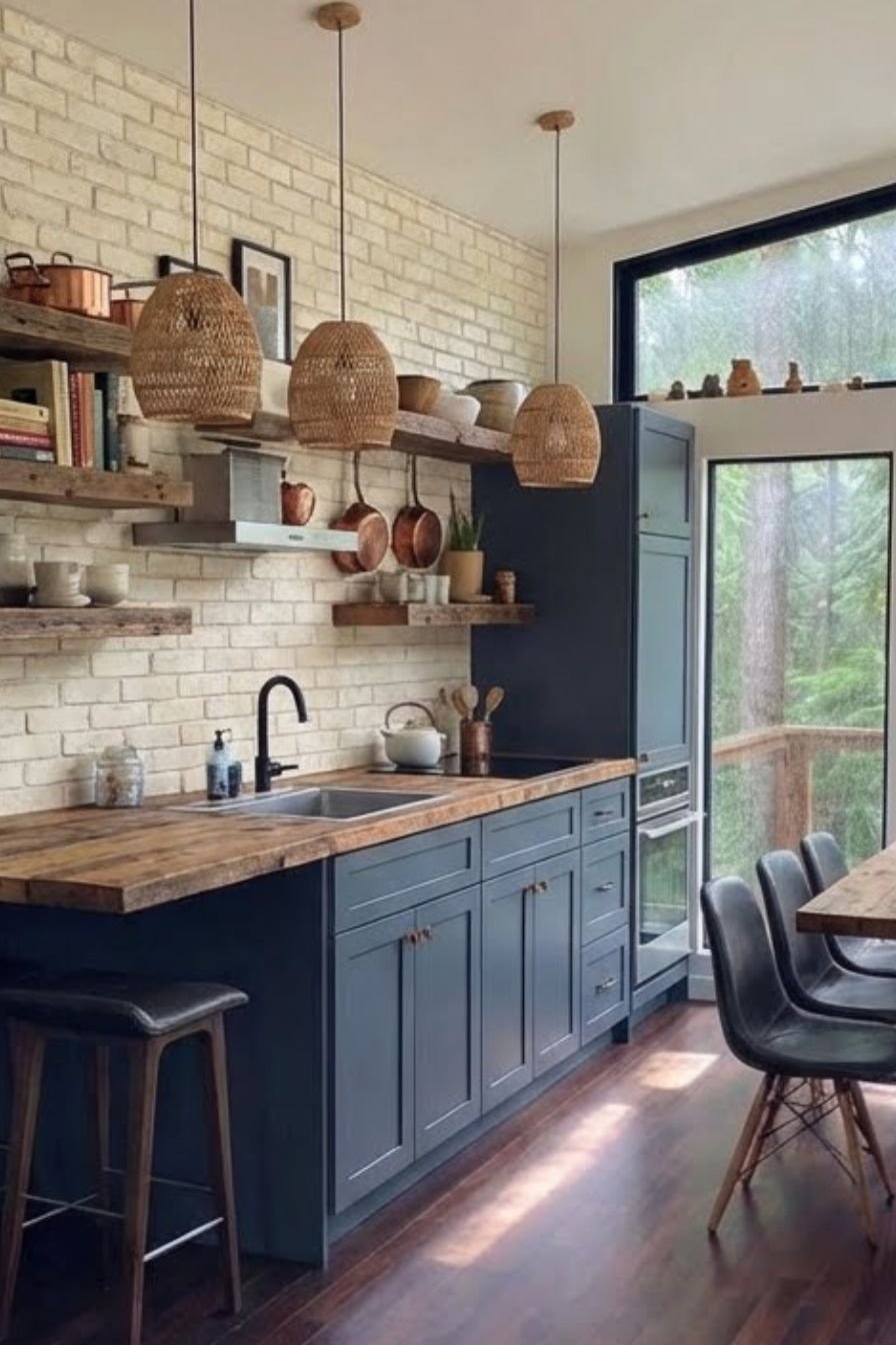
White Brick and Wood Interiors
Texture plays a massive role in how we perceive space. A small kitchen with flat, boring walls can feel like a box. Introducing white brick adds depth and character without shrinking the room. The white paint reflects light, while the brick texture creates interesting shadows. Pairing this with natural wood elements brings warmth and organic beauty. Floating wood shelves against a white brick backsplash create an open, airy feeling that closed cabinets cannot match. This style leans into the “Modern Farmhouse” or “Industrial Chic” aesthetic, which remains timeless and inviting.
The wood elements should be consistent. Match the floating shelves to the butcher block countertops or the floor. This repetition creates a sense of harmony. In a small space, too many different wood tones can look chaotic. Keep the hardware simple—matte black or brushed brass handles work well against the white and wood backdrop. The goal is to create a cozy, tactile environment where the small size feels like a deliberate design choice for intimacy rather than a limitation.
Pro Tip: Use a whitewash technique on red brick if you want to retain some of the original color variation while brightening the space.
Save this idea to your Pinterest.
Space-Optimized U-Shaped Kitchen
The U-shaped kitchen, or horseshoe layout, surrounds the cook on three sides. In a small home, this creates a highly efficient “cockpit” style workspace. Everything is within arm’s reach. While it consumes more floor space than a single-wall layout, it offers the maximum amount of countertop surface area. This is the ideal layout for serious home cooks who need room to spread out ingredients. To prevent the “U” from feeling claustrophobic, avoid using upper cabinets on all three walls.
Keep one wall free of uppers, or use open shelving instead. A large window above the sink on the middle wall is perfect for breaking up the cabinetry. Light colors are essential in a tight U-shape to prevent a tunnel effect. Glossy tile backsplashes help bounce light around the three walls. Smart corner drawers are mandatory here, as a U-shape has two corners to manage. Pull-out spice racks and narrow tray dividers fill the small gaps often left at the ends of cabinet runs.
Pro Tip: If the “U” is very narrow, use shallower 12-inch cabinets on one side instead of the standard 24-inch depth to widen the walkway.
Kitchen with a Built-in Swing
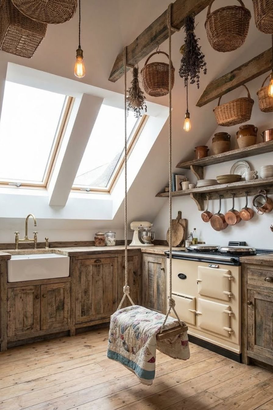
Injecting personality into a small kitchen distracts from the lack of space. A built-in swing is a whimsical, unexpected feature that delights guests and residents. It usually hangs from a reinforced beam in a doorway or an open corner. This isn’t just for looks; it provides a seat without the footprint of a bulky chair. When not in use, it pushes aside visually, unlike a rigid stool. The ropes or chains add a vertical line that draws the eye up, emphasizing ceiling height.
This design choice works best in bohemian or eclectic interiors. It pairs well with plants, macramé details, and colorful tiles. The swing creates a relaxed atmosphere, suggesting that the kitchen is a place to hang out, not just work. Ensure the swing is positioned so it doesn’t hit cabinets or the stove. It works best at the edge of the kitchen where it meets the living area. This playful element turns a cramped corner into a favorite reading nook or morning coffee spot.
Pro Tip: Use a flat wooden seat for the swing so it can double as a small side table for a tray when needed.
Traditional Single-Wall Layout
Traditional design is not reserved for massive estates. You can apply classic principles to a single-wall layout for a sophisticated look. Think shaker-style cabinets, crown molding, and elegant hardware. These details add depth and luxury. A traditional single-wall kitchen often features a freestanding range as a focal point, perhaps with a decorative hood. The symmetry often found in traditional design helps organize the small space visually. Flanking the stove with identical cabinet stacks creates a sense of order and calm.
Glass-front upper cabinets are a staple of this style. They allow you to display pretty dishware, which adds depth to the wall. The eye travels through the glass to the back of the cabinet, making the room feel deeper. Richer colors like navy blue or forest green can work on the lower cabinets if the walls and uppers remain white. A vintage-style runner rug adds pattern and protects the floor, drawing the eye down the length of the kitchen.
Pro Tip: Install a pot rail with S-hooks under the upper cabinets to display copper pans or antique utensils, freeing up drawer space.
Minimalist Kitchen Counter and Storage
Minimalism is the ultimate tool for small kitchen layouts. The philosophy is simple: if you don’t see it, it doesn’t clutter the space. This design features flat-panel cabinets with no visible handles. Touch-latch hardware keeps the surfaces completely smooth. The countertops are kept rigorously clear of appliances. Every item has a designated spot inside a cupboard. The result is a serene, architectural block that feels calm and spacious.
Materials are often matte and uniform. Concrete, stainless steel, or matte laminate create a seamless look. The sink is often integrated into the countertop material or undermounted to avoid visible rims. Appliances are fully hidden behind panels. This visual silence allows the eye to rest. In a small apartment, a minimalist kitchen blends into the background, allowing the living space to take center stage. It requires discipline to maintain, but the visual reward is a room that feels twice its actual size.
Pro Tip: Install pop-up electrical outlets in the countertop so the backsplash remains uninterrupted by plastic faceplates.
Kitchens with a Wall-Mounted Wooden Table
Floor space is the most valuable currency in a small kitchen. A fixed dining table can bankrupt your available square footage. A wall-mounted drop-leaf table is the perfect solvent. Constructed from warm wood, it acts as a functional piece of art when folded down. When lifted, it provides a sturdy surface for dining or extra prep work. This flexibility allows the kitchen to change modes throughout the day.
The mechanism should be robust but easy to operate. When the table is down, the kitchen walkway is wide and open. When up, it creates an intimate dining nook. Pairing this with folding chairs that hang on wall hooks completes the space-saving system. The wood tone of the table adds a natural element to the room, softening hard surfaces like tile and metal. It is a smart, budget-friendly solution for rentals where structural changes aren’t allowed.
Pro Tip: Place a mirror on the wall above the mounted table to reflect light and create the illusion of a window.
Mid-Century Kitchen and Dining Area
Mid-century modern design is famous for its efficient use of space and open flow. This style works beautifully in small kitchens. It typically features cabinets with walnut tones, tapered legs on furniture, and pops of bold color like teal or mustard. The furniture often has a “light” footprint—tables and chairs with thin legs allow you to see the floor beneath them. Seeing more floor makes the room feel larger.
The layout often merges the kitchen and dining into one fluid zone. A round tulip table is a classic mid-century choice that eliminates sharp corners, making it easier to navigate around in a tight space. Geometric tile patterns on the backsplash add energy. Pendant lights with globes or sputnik designs draw the eye up. This style embraces function without sacrificing fun, making a small kitchen feel lively and curated rather than cramped.
Pro Tip: Use a credenza or sideboard in the dining area to store kitchen overflow like table linens and serving platters.
G-Shaped Kitchen
The G-shaped kitchen is essentially a U-shaped layout with an added peninsula. This fourth leg of the “G” creates a distinct boundary for the kitchen. It prevents through-traffic from interfering with the cook. The peninsula offers valuable extra counter space and often serves as a breakfast bar on the outer side. This layout maximizes storage capacity, offering three walls of cabinets plus the base cabinets of the peninsula.
This design creates a cozy, enclosed feeling. It is perfect for open-plan homes where you want to clearly define the kitchen zone without building a wall. The peninsula facilitates interaction; guests can sit and chat without entering the work triangle. Lighting over the peninsula is key to defining the space. Because this layout packs a lot of cabinetry into a small footprint, keeping the upper cabinets light or using glass doors helps prevent the room from feeling heavy.
Pro Tip: Ensure the entry gap into the “G” is at least 36 inches wide to allow for comfortable movement in and out of the kitchen.
Save this idea to your Pinterest.
Popular Asked Questions
What is the most efficient layout for a small kitchen?
The galley kitchen (or parallel kitchen) is generally considered the most efficient layout for small spaces. It consists of two parallel runs of units forming a central corridor. This layout makes the “work triangle” (the distance between sink, stove, and fridge) very tight and efficient, minimizing the steps you need to take while cooking. Professional chefs often prefer this layout for its safety and efficiency.
How can I make my small kitchen look expensive?
You can upgrade a small kitchen layout by focusing on uniformity and lighting. Replace standard hardware with brushed brass or matte black handles. Use under-cabinet lighting to brighten dark corners. Stick to a cohesive color palette (like monochrome or two-tone) to reduce visual clutter. Decanting dry goods into matching glass jars on open shelves also adds a boutique, high-end feel.
Where should a fridge go in a small kitchen?
In a small kitchen layout, the fridge should be placed at the end of a cabinet run, preferably near the entrance of the kitchen. This prevents the bulky appliance from blocking light or cutting off counter space in the middle of the work zone. It also allows family members to grab a drink without entering the main cooking triangle.
What colors make a small kitchen look bigger?
White, off-white, and light grey are the best colors to expand a small space visually. These shades reflect natural and artificial light, pushing the walls outward. If you love color, use it on the base cabinets while keeping the upper cabinets and walls white. This grounds the room without making the ceiling feel lower.
Conclusion
Designing a small kitchen layout is about balancing strict functionality with personal style. Whether you choose the linear efficiency of a Single Wall layout or the storage density of a G-Shape, the goal remains the same: create a space that works for you. By using vertical storage, smart lighting, and multi-purpose furniture, you can overcome the limitations of square footage.
Your small kitchen has massive potential. It just needs the right layout to unlock it.


Leave a Comment