
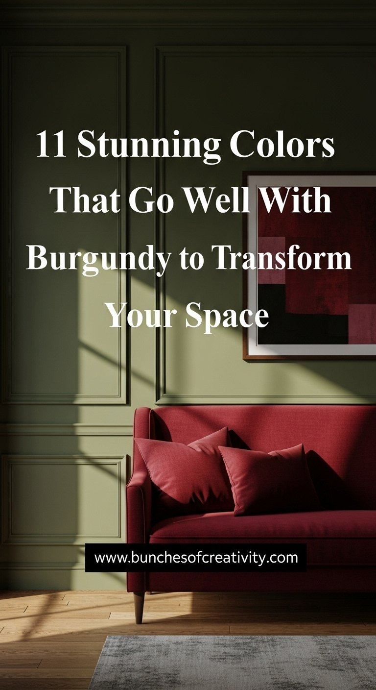
Burgundy is currently storming the design world as the defining color of 2026. It is a shade that commands attention without shouting. It offers a sense of “grounded opulence” that few other colors can match. However, many homeowners hesitate to use it because they simply do not know what pairs with it. You might worry that it will look too dark, too dated, or too difficult to balance.
The truth is that burgundy is a “super-neutral.” It acts as a rich foundation that elevates almost any color it touches. Whether you are looking to create a moody, romantic bedroom or a crisp, modern living area, the right color combination is the key to success. This guide will walk you through the 11 best colors that go well with burgundy, proving just how versatile this deep red hue really is.
Key Takeaways
- Burgundy is a “New Neutral”: It pairs effortlessly with both warm earth tones and cool metallic shades.
- Contrast is King: High-contrast pairings like White and Teal create modern energy, while low-contrast pairings like Purple and Black create moodiness.
- Texture Matters: Velvet, leather, and matte finishes significantly change how burgundy interacts with other colors.
- The 60-30-10 Rule: Use burgundy as the 30% secondary color or the 10% accent to avoid overwhelming small spaces.
Table of Contents
Grey
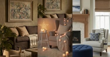
Grey serves as the ultimate modernizer for burgundy. When you pair these two together, you strip away the traditional or “stuffy” connotations that burgundy sometimes carries. The coolness of grey balances the inherent heat of the red wine tones. This combination works exceptionally well in living rooms where you want a space that feels sophisticated yet gender-neutral.
Think of a charcoal grey sofa adorned with deep burgundy velvet throw pillows. The dark grey provides a moody canvas that allows the burgundy to pop without feeling garish. For a lighter approach, consider “greige” or a soft dove grey on the walls with burgundy curtains. The light grey background prevents the room from feeling like a cave while still allowing the rich red to act as a focal point. This palette is a staple in contemporary industrial design.
Pro Tip: Use silver or chrome hardware in a grey and burgundy room to amplify the cool undertones and add a touch of sleek modernity.
Save this idea to your Pinterest.
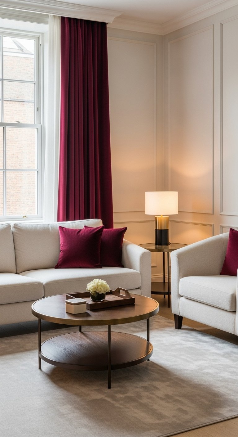
White
If you want a space that feels fresh, crisp, and high-energy, white is the perfect partner. The contrast between bright white and deep burgundy is striking. It creates a visual vibration that instantly draws the eye. This combination is often seen in modern farmhouses or Parisian-style apartments where the goal is to maintain an airy feel while adding a touch of drama.
Imagine a kitchen with stark white upper cabinets and rich burgundy lower cabinets. The white keeps the space feeling open and clean, while the burgundy grounds the room and adds warmth. You can also apply this in a bedroom with crisp white linens and a burgundy upholstered headboard. The key here is to keep the white pure. Creamy whites can sometimes look muddy next to certain shades of burgundy, so stick to cooler, brighter whites for the most impact.
Pro Tip: Add natural wood elements to a white and burgundy room to bridge the gap between the high contrast colors.
Pink
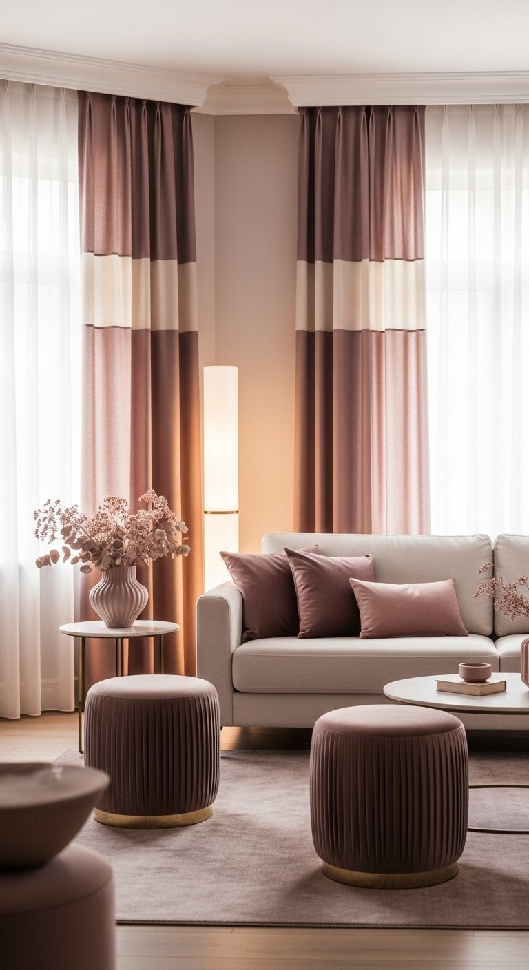
Monochromatic color schemes are a massive trend for 2026, and pairing burgundy with pink is the ultimate expression of this. Since pink is essentially a tint of red, these two colors sit next to each other on the color wheel. This creates a harmonious, analogous look that is incredibly pleasing to the eye. It feels romantic, soft, and feminine without being overly sugary.
Blush pink is the most popular choice here. A dusty rose wall with a burgundy velvet armchair creates a cozy reading nook that feels like a warm hug. The burgundy acts as the “shadow” to the pink’s “light,” adding depth and maturity to the space. This combination is perfect for bedrooms or dressing rooms where you want to cultivate a sense of softness and luxury.
Pro Tip: Use different textures to keep this look interesting. Pair a silk pink pillow with a chunky knit burgundy throw.
Save this idea to your Pinterest.
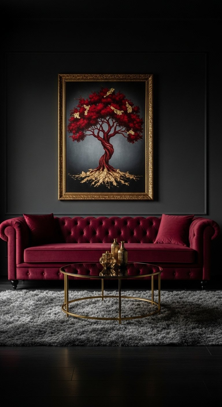
Black
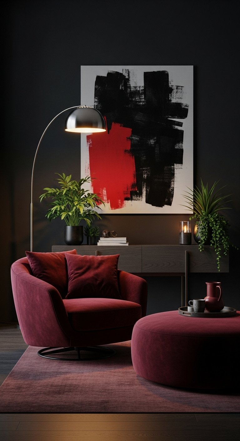
For those who love the “Dark Academia” aesthetic or moody maximalism, black and burgundy is the power couple. This combination is intense, dramatic, and undeniably sexy. It works best in spaces that are meant for evening use, such as a dining room, a powder room, or a media room. The lack of light in this palette creates an enveloping atmosphere that feels private and exclusive.
To pull this off without making the room feel like a dungeon, you need to rely on sheen and lighting. Use matte black paint on the walls and pair it with glossy burgundy tiles or a lacquered sideboard. The reflection of light will break up the heaviness. Alternatively, a black leather sofa with a burgundy Persian rug creates a classic, masculine library vibe that never goes out of style.
Pro Tip: Ensure you have ample ambient lighting. Warm yellow bulbs will make the burgundy glow against the black backdrop.
Purple
Purple and burgundy might seem like an unlikely pair, but they share blue undertones that make them surprisingly compatible. This combination leans heavily into a “Jewel Tone” palette. It evokes images of royalty, stained glass, and bohemian luxury. When executed correctly, it creates a space that feels artistic and curated rather than matched.
Deep plum or eggplant purple works best. Try a burgundy sofa with plum accent chairs, or mix the two colors in a patterned rug. This look thrives on excess, so do not be afraid to layer patterns. A floral wallpaper featuring both burgundy and purple flowers can tie the room together beautifully. This is a bold choice for a creative studio or an eclectic living room.
Pro Tip: Add a third neutral color, like charcoal or dark wood, to give the eye a place to rest amidst the rich colors.
Save this idea to your Pinterest.
Comparison: The “Mood” of Dark Pairings
| Feature | Burgundy & Black | Burgundy & Purple |
|---|---|---|
| Primary Vibe | Masculine, Sleek, Dramatic | Bohemian, Artistic, Royal |
| Best Room | Dining Room, Media Room | Bedroom, Creative Studio |
| Lighting Needs | High (to prevent darkness) | Moderate (to enhance mood) |
| Texture Focus | Leather, Metal, Matte Paint | Velvet, Silk, Patterned Fabric |
Get The Look: The Moody Lounge
To achieve a sophisticated dark aesthetic, you will need:
- Paint: Matte Black or Deep Plum.
- Furniture: Burgundy Velvet Sofa.
- Accents: Gold framing or brass lamps.
- Flooring: Dark Walnut or Ebony wood stains.
Related posts :
- 10 Cozy Living Room Ideas Featuring Warm Colors That Instantly Transform Your Home
- 15 Breathtaking Colorful Apartment Decor Inspiration Ideas That Instantly Energize Your Space
- 18 Stunning Home Decoration Ideas To Jazz Things Up & Instantly Refresh Your Space
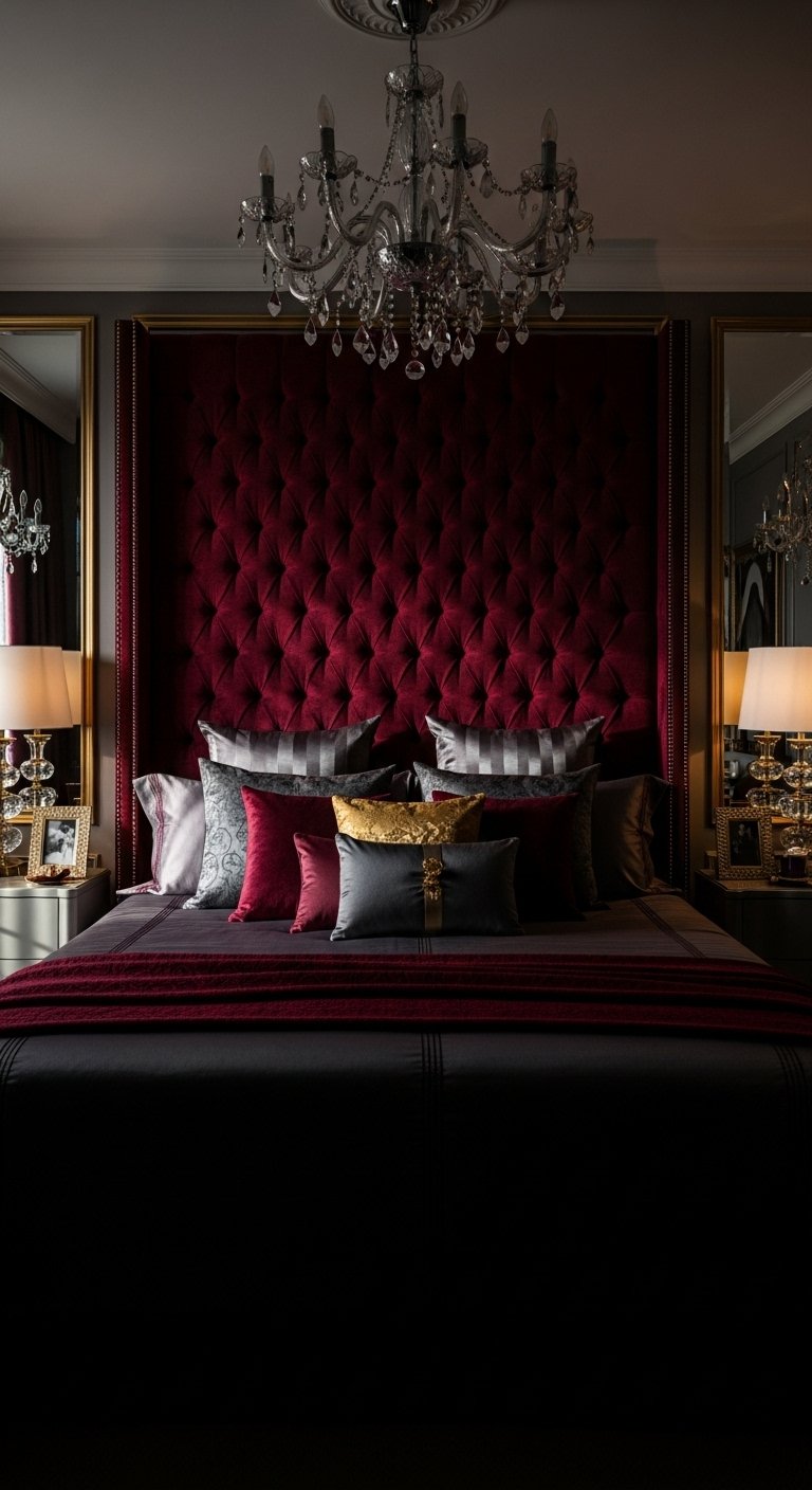
Gold
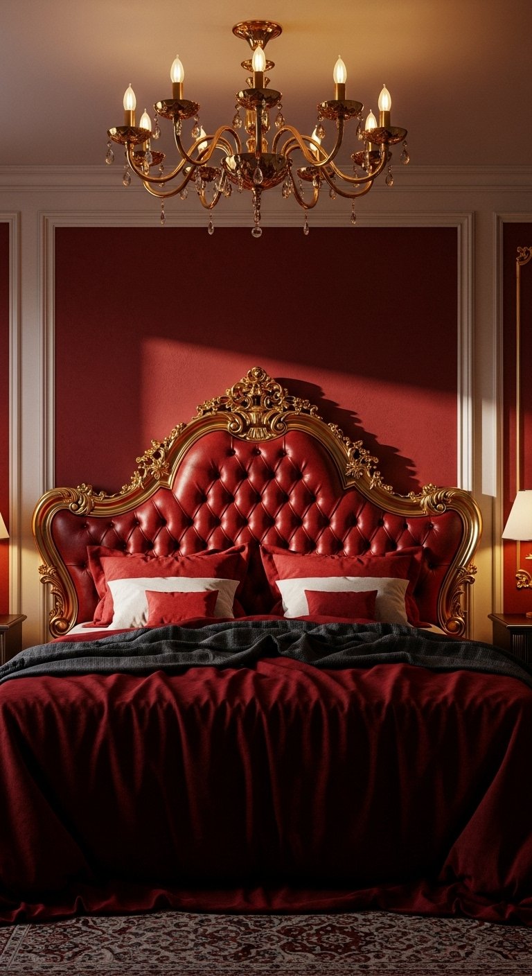
There is perhaps no combination more classic than burgundy and gold. This pairing screams luxury. It is the color palette of old theaters, royal palaces, and high-end hotels. Gold warms up the burgundy even further, bringing out the yellow and brown notes in the red. This is the go-to choice for formal spaces where you want to impress guests.
You do not need to paint your walls gold to get this effect. Instead, think of gold as the “jewelry” of the room. A burgundy wall looks stunning with a large gold-framed mirror or a brass gallery rail. In a kitchen, burgundy cabinets with brushed gold handles and a gold faucet create a look that is both vintage and trendy. The reflective quality of gold adds sparkle to the deep matte nature of burgundy.
Pro Tip: Stick to brushed or antique brass finishes. Shiny yellow gold can sometimes look cheap against the visual weight of burgundy.
Beige
If you love the warmth of burgundy but want a calm, earthy home, beige is your answer. Unlike white, which creates a high-contrast pop, beige creates a low-contrast, harmonious blend. This is the essence of the “Organic Modern” style. Beige softens the burgundy, making it feel more like a color found in nature, like red clay or autumn leaves.
Try a beige linen sofa with burgundy throw blankets. The texture of the linen combined with the richness of the burgundy creates a tactile, inviting space. Beige walls also serve as a much warmer backdrop for burgundy art or furniture than stark white. This combination is particularly effective in spaces with lots of natural light, as the sun will blend the two colors into a golden, cozy glow.
Pro Tip: Layer different shades of beige (sand, oatmeal, taupe) to create a rich, textured base for your burgundy accents.
Save this idea to your Pinterest.
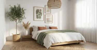
Green
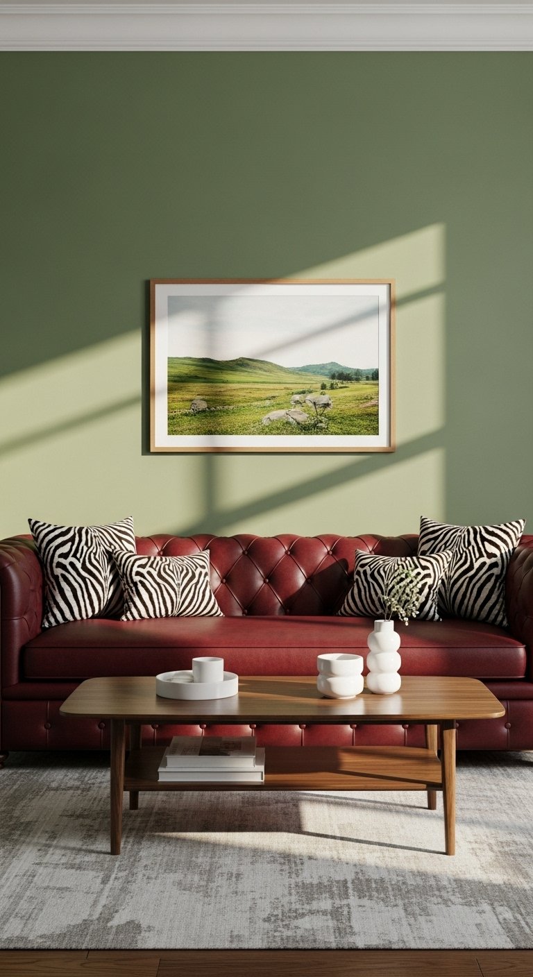
Green and red are complementary colors on the color wheel, meaning they naturally intensify each other. However, to avoid looking like a Christmas decoration, you must choose the right shades. Forget bright kelly green and fire engine red. Instead, think of deep forest green, sage, or olive paired with burgundy. This combination mimics the colors of a garden or a vineyard.
Olive green is particularly trendy right now. An olive green wall with a burgundy leather chair creates a sophisticated, library-esque feel. Sage green offers a lighter, fresher alternative that works well in bathrooms or kitchens. The key is to ensure both colors have the same “weight” or saturation level. A muted, muddy green pairs best with a deep, muddy burgundy.
Pro Tip: Use live plants as your primary source of green. A large fiddle leaf fig next to a burgundy sofa is a perfect, natural way to introduce this color pairing.
Blue
Navy blue and burgundy is a preppy, classic combination that exudes confidence. It is often associated with traditional menswear or nautical clubs, but it translates beautifully into home decor. Both colors are dark and commanding, so they fight for attention in the best way possible. This pairing works well in boys’ bedrooms, offices, or formal living rooms.
To keep the room from feeling too dark, you need a third lighter color to break it up, usually white or cream. A navy blue rug, a burgundy sofa, and white walls create a balanced, timeless look. For a bolder approach, paint the walls navy and use burgundy drapery. The blue walls will recede, making the burgundy fabric pop forward visually.
Pro Tip: Add patterns like plaid or stripes to lean into the “Ralph Lauren” aesthetic that this color combo naturally evokes.
Save this idea to your Pinterest.
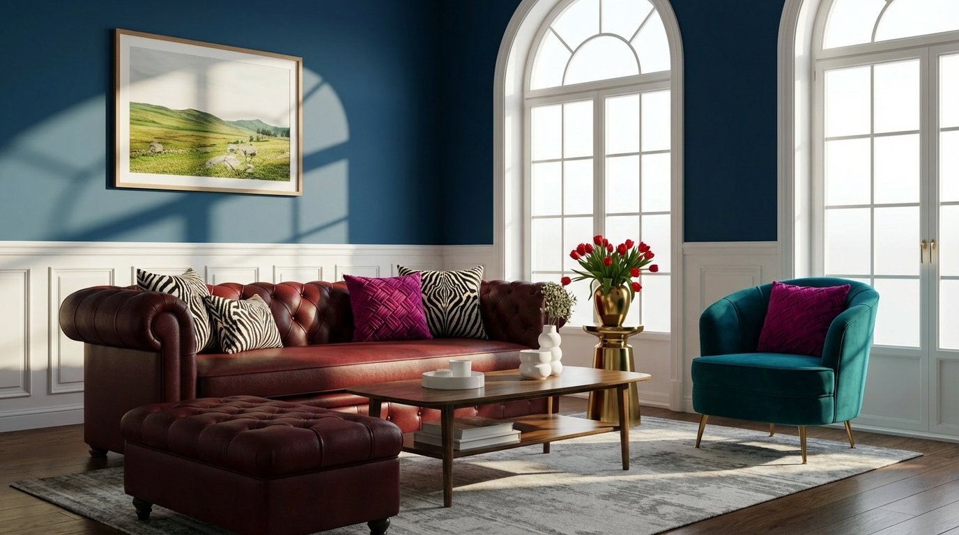
Teal
For the boldest, most artistic homeowners, teal and burgundy is a match made in heaven. Teal is a blue-green, which sits directly across from red-orange on the color wheel. This creates a “split-complementary” contrast that is vibrant and unexpected. This combination feels exotic, global, and eclectic. It is often found in Moroccan or Bohemian design styles.
Imagine a deep teal velvet sofa with burgundy silk cushions. The cool, watery tones of the teal make the hot, fiery tones of the burgundy vibrate. This is not a combination for the faint of heart, but when done right, it is a showstopper. It works best in rooms where you want to stimulate conversation and energy, such as a dining room or a lounge.
Pro Tip: Use gold accents to tie these two jewel tones together. Gold acts as a bridge that harmonizes the warm burgundy and the cool teal.
Orange
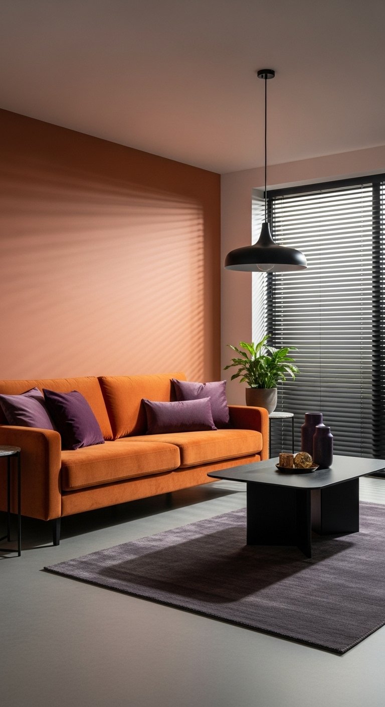
Burgundy and orange is the ultimate autumn palette. Since they are analogous colors (sitting near each other on the wheel), they blend together to create a look of extreme warmth. This combination is perfect for creating a “cozy cave” vibe. It reminds us of falling leaves, spices, and sunsets.
To avoid a clash, opt for “burnt” oranges like terracotta, rust, or pumpkin rather than bright neon orange. A burgundy rug paired with terracotta pots and rust-colored throw pillows creates a layered, earthy look. This is perfect for a living room that needs to feel inviting during the colder months. It creates a physical sensation of warmth just by looking at it.
Pro Tip: Incorporate natural textures like rattan, wicker, or wood. These brown-based materials help ground the orange and burgundy, preventing the room from looking too fiery.
Save this idea to your Pinterest.
Comparison: The “Energy” of Bold Pairings
| Feature | Burgundy & Teal | Burgundy & Orange |
|---|---|---|
| Visual Effect | High Contrast, Vibrating | Low Contrast, Blending |
| Mood | Exotic, Energetic, Eclectic | Cozy, Warm, Autumnal |
| Best Season | All Year (Jewel Tones) | Fall/Winter |
| Style | Bohemian, Glam | Rustic, Earthy |
Get The Look: The Earthy Retreat
To create a warm, grounded space, you will need:
- Paint: Warm Beige or Terracotta.
- Furniture: Burgundy Leather Ottoman.
- Accents: Woven baskets, clay pottery.
- Flooring: Oak or bamboo.
Popular Asked Questions
What colors go with burgundy clothes?
Burgundy clothing acts as a rich neutral. It pairs beautifully with camel, beige, and denim blue for casual looks. For a more formal outfit, pair it with black, charcoal grey, or navy. If you want a bold fashion statement, try pairing a burgundy top with mustard yellow or forest green accessories.
Does burgundy go with black or brown?
Burgundy goes excellently with both. Pairing it with black creates a sleek, modern, and slightly gothic or dramatic look. Pairing it with brown (especially dark chocolate or cognac leather) creates a warm, earthy, and traditional rustic vibe.
Is burgundy a warm or cool color?
Burgundy is technically a warm color because it is a shade of red. However, it often contains purple or blue undertones, which gives it a “cooler” feel than a bright fire-engine red. This unique position allows it to mix well with both warm colors (gold, orange) and cool colors (grey, blue).
What is the complementary color of burgundy?
The direct complementary color of burgundy (a dark red-purple) is a dark green or teal. These colors sit opposite burgundy on the color wheel. Using them together creates the highest possible contrast, making both colors appear brighter and more intense.
Conclusion
Burgundy is more than just a fleeting trend; it is a timeless color that brings depth, warmth, and sophistication to any home. Whether you choose to pair it with the crispness of white, the drama of black, or the luxury of gold, you cannot go wrong. The key is to decide on the “mood” you want to create. Do you want a cozy cave? Go for Orange or Beige. Do you want a modern gallery? Go for Grey or White.
Don’t be afraid to experiment with textures and lighting to make the color truly sing. Start small with a few throw pillows or a rug, and soon you will find yourself falling in love with this rich, versatile hue.

Leave a Comment