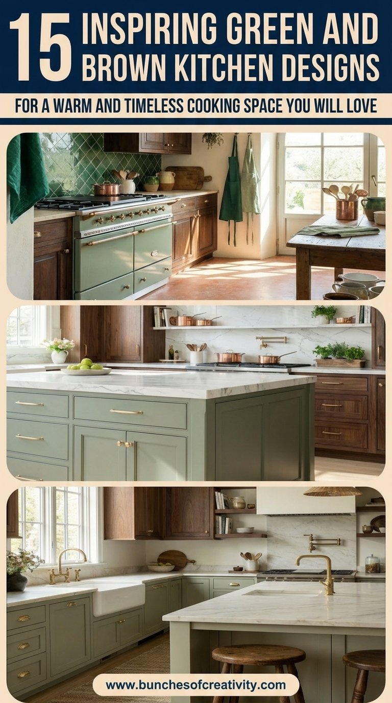
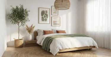
The era of the sterile, all-white kitchen is officially fading. In its place, a richer, more grounded aesthetic is taking over: the green and brown kitchen. This isn’t just a fleeting trend; it is a movement toward biophilic design, where our indoor spaces mirror the calming, restorative qualities of the outdoors.
If you have been scrolling through Pinterest lately, you have likely noticed a shift. Homeowners are trading high-gloss finishes for matte sage green cabinets, and swapping cool gray floors for warm walnut wood accents. The combination of green and brown creates an organic modern kitchen that feels both sophisticated and incredibly cozy. It solves the problem of “cold” modern design by injecting warmth without sacrificing elegance.
Whether you are planning a full renovation or a simple cabinet refresh, this guide explores 15 stunning ways to master this earth-tone palette.
Key Takeaways
- Biophilic Balance: Green and brown mimic the forest floor and canopy, proven to lower stress and increase comfort in the home.
- Versatility: This palette works across all styles, from rustic farmhouse to sleek contemporary.
- Texture is Key: The success of this look relies on mixing materials like natural wood grain, matte paint, and stone.
- Timelessness: Unlike trendy brights, earth tones age gracefully and maintain high resale value.
Table of Contents
- Sage Green Cabinets With Rich Walnut Accents
- Olive and Natural Oak: A Rustic Modern Blend
- Forest Green Islands With Reclaimed Wood Details
- Hunter Green Walls Meet Butcher Block Countertops
- Mint Green Cabinetry With Dark Mahogany Finishes
- Emerald and Espresso: A Bold Statement Duo
- Weathered Wood Beams With Soft Green Paneling
- Two-Toned Green Cabinets With Wooden Open Shelving
- Dark Teak and Pistachio: A Contemporary Mix
- Moss Green Backsplash With Bamboo Elements
- Vintage-Inspired Green Storage With Stained Wood Floors
- Celadon Green Walls With Rustic Brown Cabinetry
- Eucalyptus-Toned Upper Cabinets With Walnut Base
- Mediterranean Green Tiles With Cedar Accents
- Jade Green Peninsula With Distressed Wood Features
- Popular Asked Questions
- Conclusion
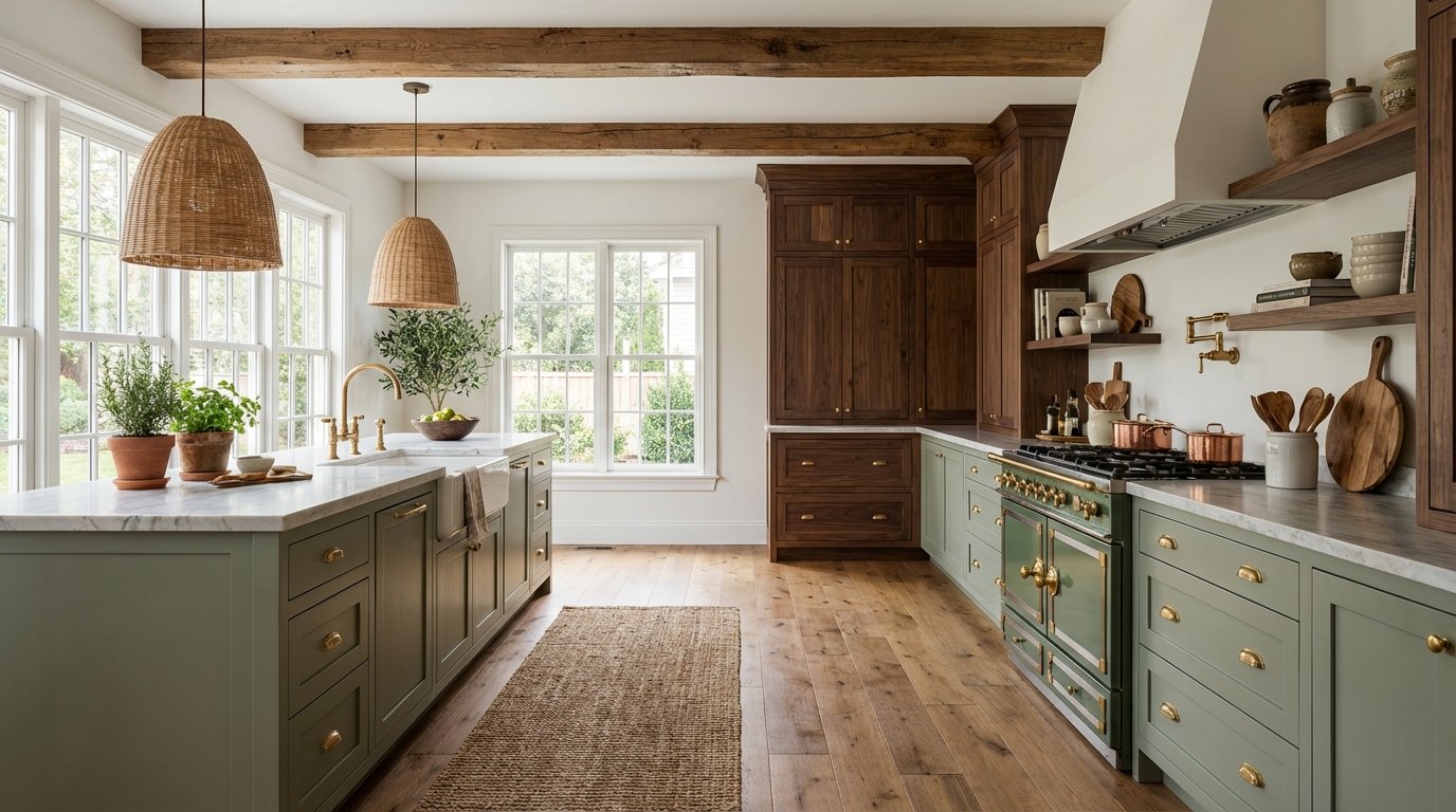
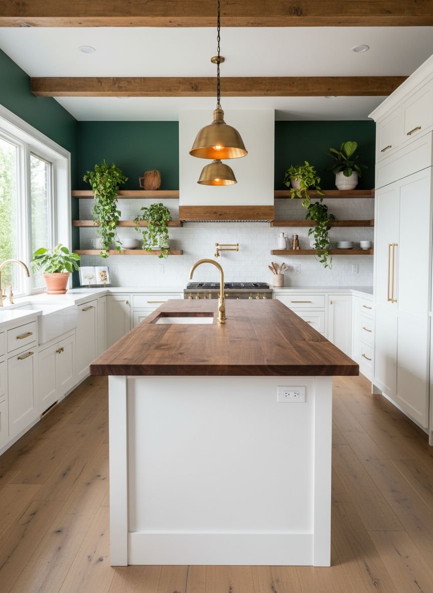
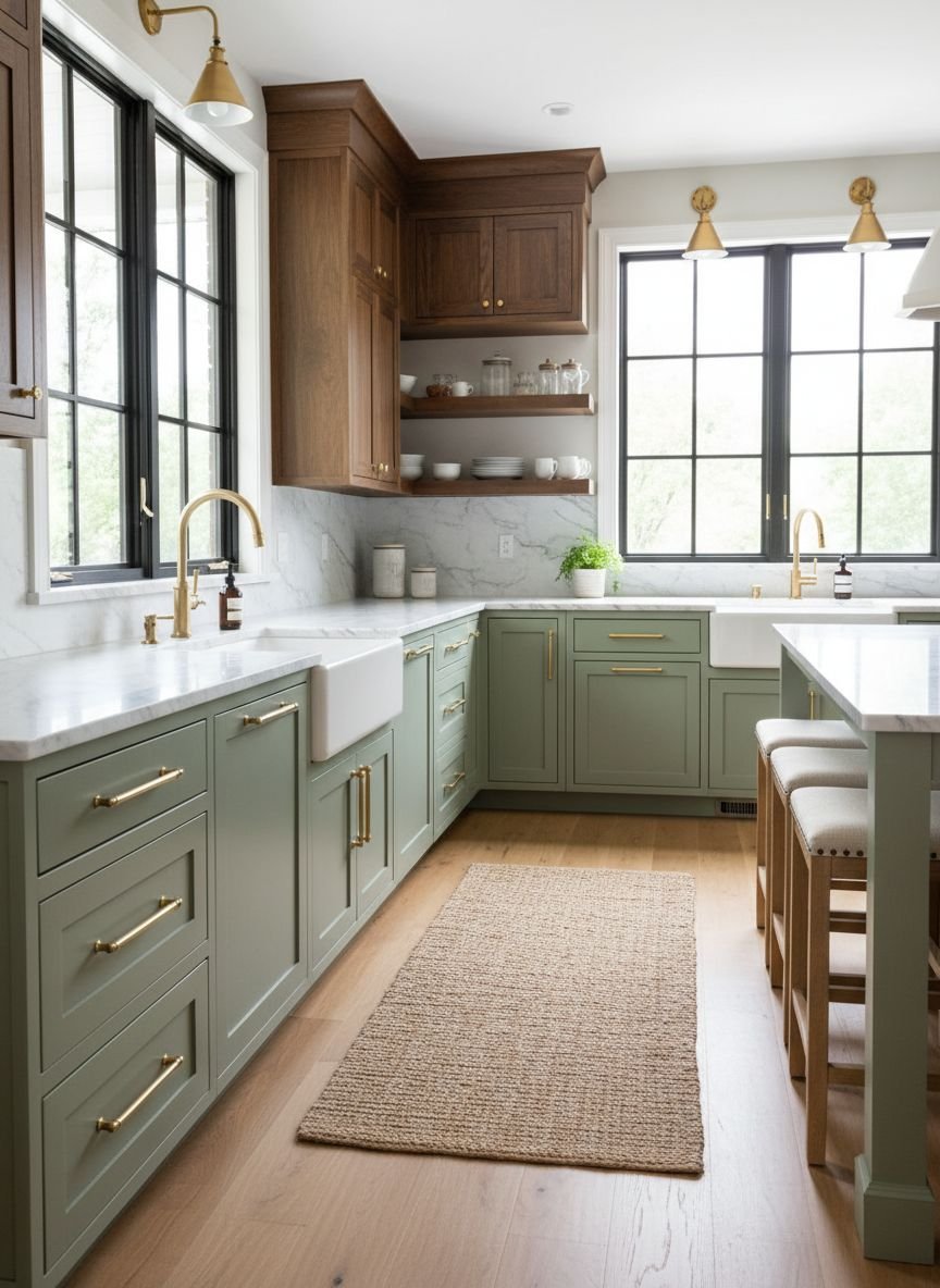
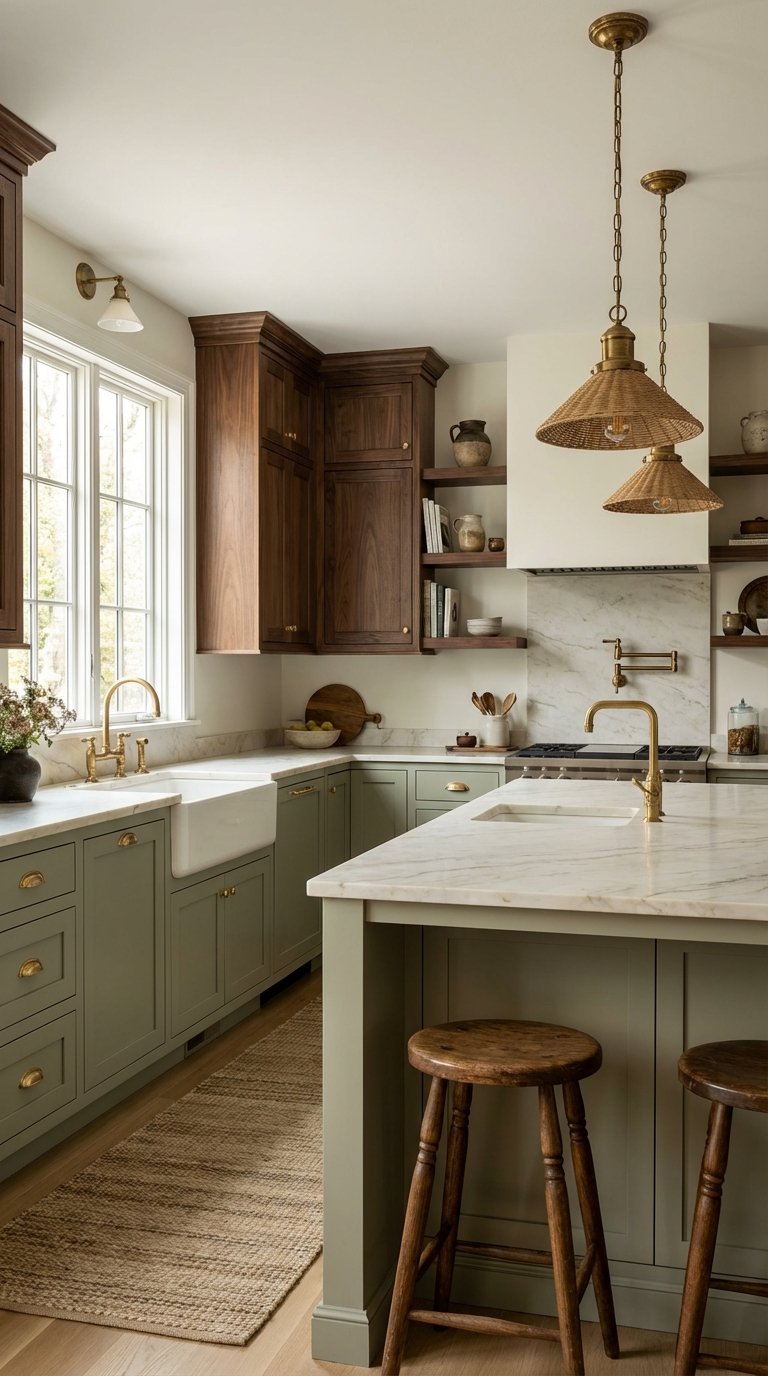
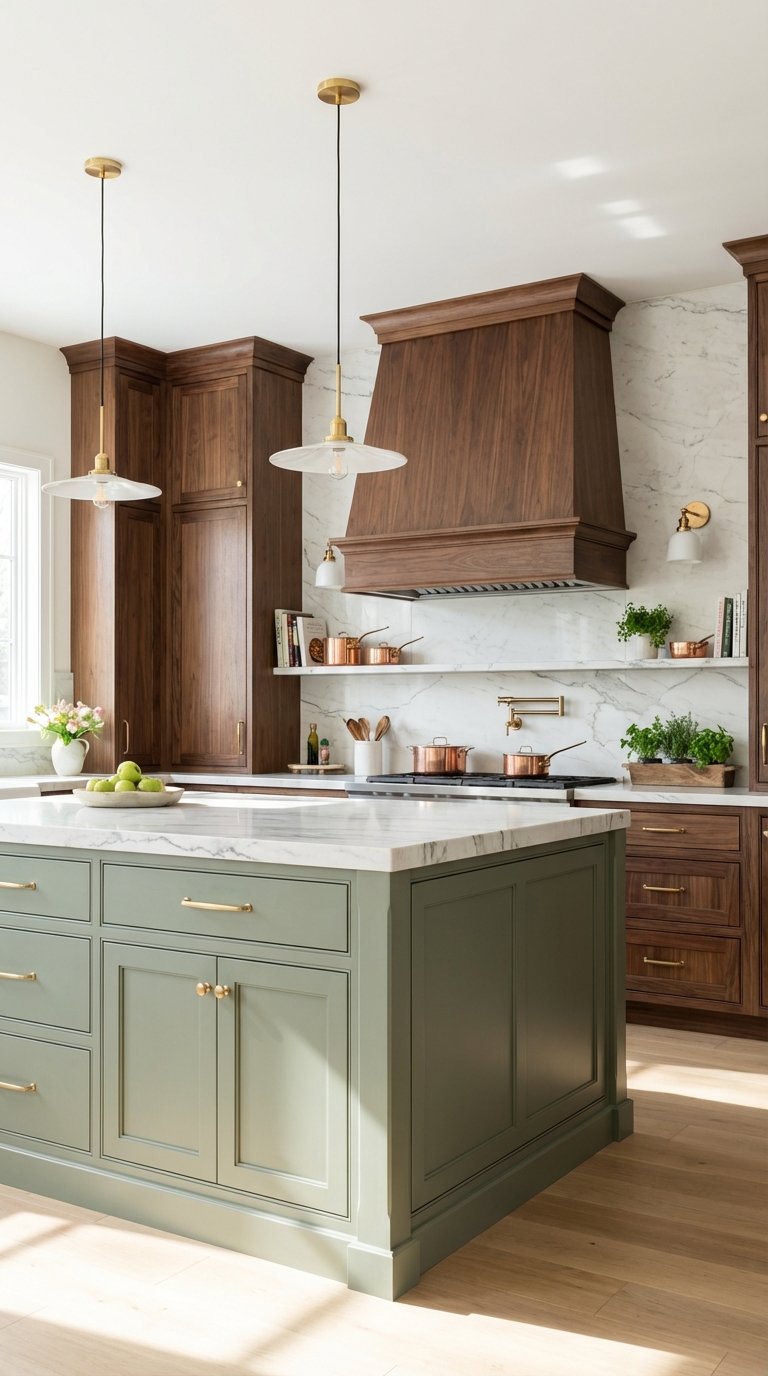
Sage Green Cabinets With Rich Walnut Accents

Sage green has solidified itself as the “new neutral” in interior design. When you pair soft, muted sage cabinetry with the deep, chocolate tones of rich walnut wood, you create a kitchen that feels instantly luxurious yet approachable. The visual analysis here is all about contrast in saturation; the pale, dusty green allows the intricate grain of the walnut to take center stage without competing for attention.
From a design principle standpoint, this combination anchors the room. The walnut provides a heavy visual weight at the bottom (flooring or lower cabinets), while the sage keeps the upper visual field airy and light. To implement this, consider using walnut for your kitchen island base and open shelving, while painting the perimeter cabinets in a matte sage. This prevents the dark wood from making the kitchen feel too small or cave-like.
Pro Tip: Use unlacquered brass hardware. It bridges the gap between the cool green undertones and the warm wood, aging beautifully over time to add vintage character.
Micro-CTA: Save this idea to your Pinterest board for your next remodel.
Olive and Natural Oak: A Rustic Modern Blend
If you prefer a lighter, more Scandinavian approach to the green and brown kitchen, olive and natural oak is your ideal match. Olive green brings a savory, earthy richness that feels more organic than a bright grass green. When paired with pale, natural white oak, the result is a serene space that feels sun-drenched and welcoming.
This design relies on texture rather than high contrast. The matte finish of olive paint complements the raw, low-sheen look of white oak. This is often seen in “Japandi” (Japanese-Scandi) kitchens where simplicity is key. To get this look, avoid heavy stains on your wood. Opt for a clear, matte sealant that preserves the wood’s natural blonde color. Use olive green for a statement backsplash or a feature wall of cabinetry.
Pro Tip: Add woven textures like rattan pendant lights or jute runners to enhance the organic, rustic feel without adding new colors.
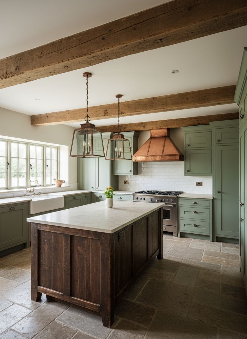
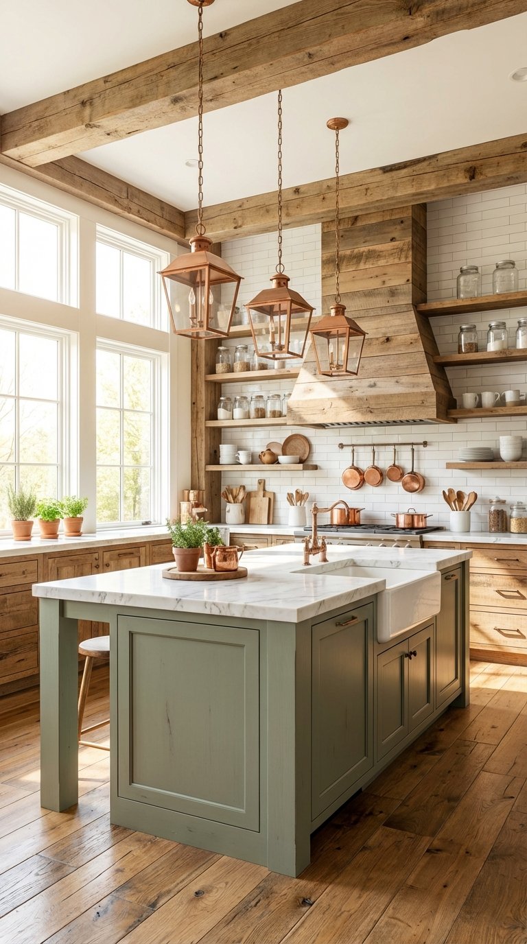
Forest Green Islands With Reclaimed Wood Details
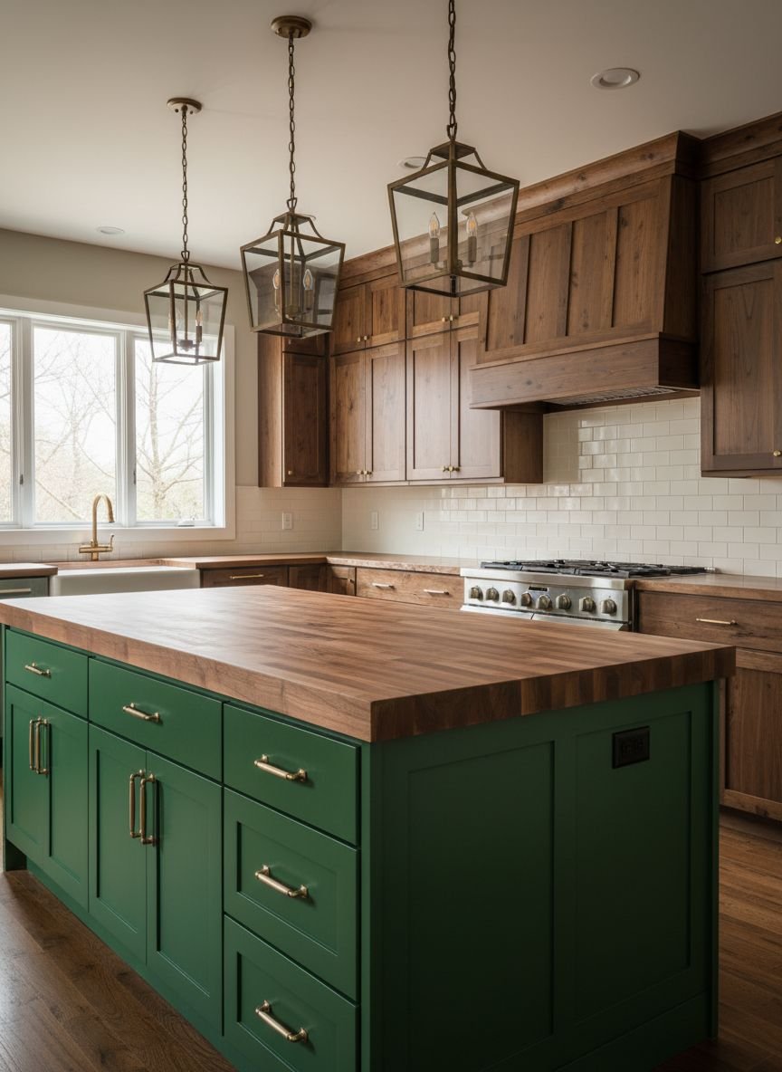
For those who love the drama of a farmhouse aesthetic, a forest green kitchen island serves as a stunning focal point. Forest green is a deep, intellectual color that commands attention. Pairing it with rough-hewn, reclaimed wood details creates a narrative of history and sustainability.
The visual success of this design comes from the “rough meets smooth” texture clash. The sleek, painted finish of the forest green island contrasts beautifully with the knots, nail holes, and imperfections of reclaimed wood beams or floating shelves. This is a perfect implementation of sustainable design, reusing materials to add soul to a new space.
Pro Tip: If you can’t source true reclaimed wood, look for “distressed” wood veneers or butcher block that mimics the aged look.
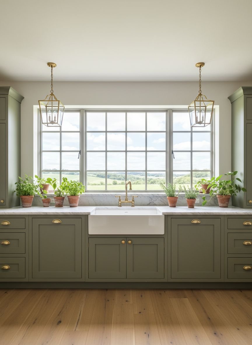
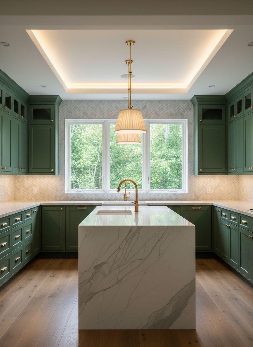
Hunter Green Walls Meet Butcher Block Countertops
Hunter green is a classic, heritage color that evokes the feeling of an old English library or a country estate. When applied to walls, it wraps the kitchen in a cozy embrace. To balance this darkness, butcher block countertops are essential. They introduce a large surface area of warm brown that reflects light differently than stone.
This combination is excellent for budget-conscious renovators. Paint is an affordable way to transform a room, and butcher block is significantly cheaper than marble or quartz. The design principle here is “enveloping.” By painting the walls dark, you blur the boundaries of the room, while the wood countertops provide a horizontal grounding line.
Pro Tip: Seal your butcher block with food-safe mineral oil monthly to keep the warm brown tone vibrant and water-resistant.
Mint Green Cabinetry With Dark Mahogany Finishes
Mint green often gets a bad rap as being too “retro” or “ice cream parlor,” but when anchored by dark mahogany, it becomes surprisingly sophisticated. This is a high-contrast look that plays with the complementary nature of red (in the mahogany) and green.
The deep reddish-brown of the mahogany creates a serious, formal foundation that stops the mint green from feeling juvenile. This style works exceptionally well in period homes, such as Victorians or Craftsman bungalows, where dark wood trim is already present. To implement this, keep the mint shade very pale and gray-toned rather than neon.
Pro Tip: Use glass-front cabinet doors on the mint upper cabinets to break up the color and display white ceramics, which tie the look together.
Comparison: Light Wood vs. Dark Wood in Green Kitchens
| Feature | Light Wood (Oak, Ash, Birch) | Dark Wood (Walnut, Mahogany) |
|---|---|---|
| Best Green Pair | Olive, Pistachio, Pale Sage | Forest, Emerald, Hunter, Mint |
| Vibe | Airy, Scandi, Modern, Casual | Moody, Luxurious, Traditional |
| Space Perception | Makes small kitchens feel larger | Adds coziness to large kitchens |
| Maintenance | Hides dust well, shows spills | Shows dust, hides dark stains |
Related posts :
- 13 Cozy Earthy Kitchen Designs That Instantly Create a Warm Vibe Transform Your Home
- 15 Stunning Japandi Kitchen Design Ideas That Will Instantly Transform Your Home Into a Zen Sanctuary
- 15 Genius Kitchen Corner Cabinet & Decor Ideas That Instantly Double Your Storage
Emerald and Espresso: A Bold Statement Duo
If you want your kitchen to feel like a boutique hotel bar, look no further than emerald green and espresso wood. This is a moody, dramatic palette that screams luxury. Emerald is a jewel tone that reflects light beautifully, while espresso wood is nearly black, providing a sleek, modern edge.
This design works best in kitchens with good artificial lighting or abundant natural light, as the dark tones can absorb light. The key is to use glossy finishes. A high-gloss emerald tile backsplash paired with matte espresso cabinets creates a stunning interplay of light and shadow.
Pro Tip: Install under-cabinet lighting to ensure the dark espresso work surfaces remain functional and visible.
Weathered Wood Beams With Soft Green Paneling
This design channels the “Cottagecore” aesthetic that has taken social media by storm. Soft, pastel green beadboard or shiplap paneling brings a quaint, nostalgic feel. When paired with rustic, weathered wood ceiling beams, the kitchen feels like a centuries-old farmhouse.
The vertical lines of the paneling draw the eye upward to the wood beams, emphasizing the height of the room. This is a textural masterclass; the roughness of the beams makes the painted wood look even smoother and softer. It is an ideal style for creating a relaxed, family-centric kitchen.
Pro Tip: Keep the ceiling painted white between the beams to maintain brightness and contrast against the weathered wood.
Two-Toned Green Cabinets With Wooden Open Shelving
Two-toned cabinets are a practical solution for homeowners who want color but fear it might be overwhelming. A popular configuration is painting the lower cabinets a deep green (like moss or forest) and keeping the upper walls white or neutral. Adding thick wooden open shelving bridges the gap between the two zones.
The wood shelves act as a visual “belt,” cinching the design together. They bring the warmth of the floor up to eye level. This layout also makes the kitchen feel more expansive, as there are no heavy upper cabinets blocking the view.
Pro Tip: Style the open shelves with items that match your palette—brown wooden bowls, green glassware, and white plates.
Micro-CTA: Love this airy look? Pin it to your “Dream Kitchen” board.
Dark Teak and Pistachio: A Contemporary Mix
Pistachio is a vibrant, energetic yellow-green that feels incredibly fresh. Pairing it with dark teak, a wood known for its durability and golden-brown grain, creates a unique, contemporary look often found in Mid-Century Modern homes.
The yellow undertones in the pistachio green pick up the golden highlights in the teak wood, creating a cohesive, warm atmosphere. This style avoids the “muddy” look that some earth tones can have. It is crisp, clean, and invigorating—perfect for a morning coffee spot.
Pro Tip: Keep the hardware minimal. Handleless cabinets or simple finger pulls allow the color and wood grain to speak for themselves.
Moss Green Backsplash With Bamboo Elements
For the ultimate eco-friendly kitchen, combine a moss green backsplash with sustainable bamboo cabinetry or accents. Moss green is a subdued, calming shade that mimics the forest floor. Bamboo is a fast-growing, renewable material with a distinct linear grain and a light, straw-like color.
This combination is the definition of “Zen.” The linear grain of bamboo adds a modern, architectural feel, while the moss green tiles introduce an organic softness. This look is perfect for smaller kitchens, as the light color of the bamboo keeps the space feeling open.
Pro Tip: Use handmade Zellige tiles for the backsplash. Their uneven surface reflects light like water, adding movement to the moss green color.
Get The Look: The Earthy Essentials
Want to recreate these styles? Here are the material staples you need:
- Paint: Look for “Sage,” “Olive,” or “Hunter” in matte or eggshell finishes.
- Wood: Walnut for luxury, Oak for rustic, Bamboo for modern.
- Countertops: Butcher block (budget) or Green Soapstone (splurge).
- Accents: Terracotta pots, wooden cutting boards, jute rugs.
Vintage-Inspired Green Storage With Stained Wood Floors
There is something undeniably charming about a freestanding green larder or hutch sitting atop original stained wood floors. This design moves away from the “fitted” kitchen look and embraces a more unfitted, furniture-style layout.
A vintage green cabinet—perhaps a flea market find painted in a chalky heritage green—adds personality and history. The stained wood floors provide a continuous, warm base that runs through the entire house. This lack of a break in flooring helps the kitchen flow seamlessly into dining or living areas.
Pro Tip: Don’t worry if the wood stain doesn’t perfectly match other wood furniture. The “collected” look thrives on mixed wood tones.
Celadon Green Walls With Rustic Brown Cabinetry
Celadon is a pale, blue-green pottery glaze color that is incredibly soothing. Instead of green cabinets, try painting the walls celadon and installing rustic brown wood cabinetry. This flips the standard script and creates a light, airy envelope for the room.
The rustic brown cabinets ground the space, while the celadon walls recede, making the room feel wider. This is an excellent strategy for kitchens with limited natural light, as celadon has a cool undertone that mimics daylight.
Pro Tip: Use a satin finish paint for the walls in the kitchen. It is easier to wipe down than flat paint but less shiny than semi-gloss.
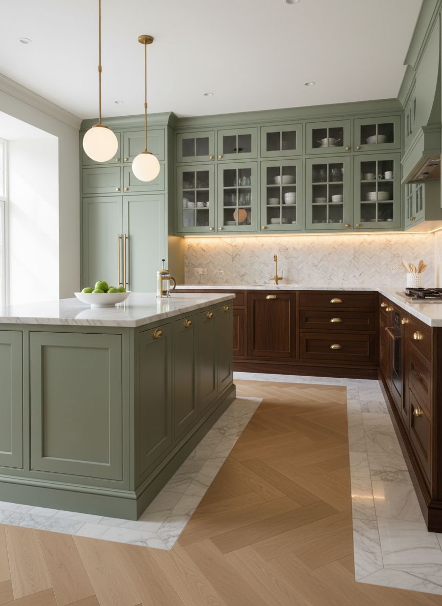
Eucalyptus-Toned Upper Cabinets With Walnut Base
Eucalyptus is a gray-green shade that is slightly cooler than sage. Using this color on upper cabinets while keeping the base cabinets in a dark walnut creates a sophisticated “tuxedo” effect with a twist.
The darker walnut base anchors the kitchen, hiding scuffs and footprints—a practical choice for families with pets or kids. The lighter eucalyptus uppers blend with the ceiling, drawing the eye up. This creates a balanced visual hierarchy that feels stable and calm.
Pro Tip: Carry the eucalyptus color onto the ceiling for a modern, box-like effect that makes the white countertops pop.
Mediterranean Green Tiles With Cedar Accents
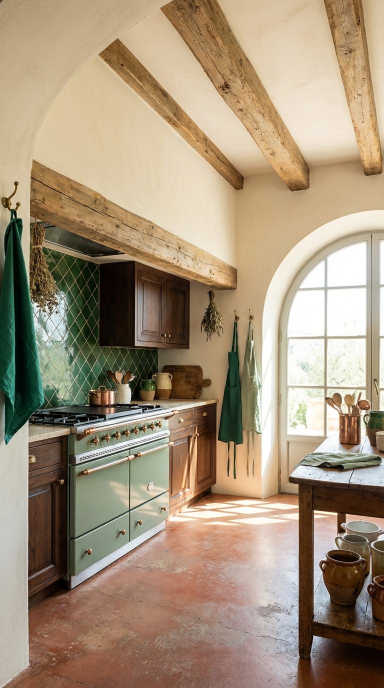
Transport your kitchen to the coast with Mediterranean green tiles and cedar wood. Cedar has a reddish-warm hue and a wonderful aroma. When paired with emerald or sea-green glazed tiles, it evokes the feeling of a Spanish or Italian villa.
This design is all about the warmth of the sun and the cool of the sea. Use the tiles for a full-height backsplash or a statement floor. Use cedar for exposed shelving or ceiling beams. The red-green complementary color scheme is vibrant and appetite-stimulating.
Pro Tip: Add terracotta floor tiles to complete the Mediterranean triad of colors (Green, Wood/Red, Terracotta/Orange).
Jade Green Peninsula With Distressed Wood Features
Jade green is a milky, gemstone-inspired color that feels rare and special. Using it on a kitchen peninsula creates a jewelry-box effect in the center of the room. Pairing it with distressed wood stools or flooring adds a “wabi-sabi” element—finding beauty in imperfection.
The distressed wood prevents the jade from feeling too precious or untouchable. It says, “This is a working kitchen, not a museum.” This blend of high-end color and worn texture creates a space that feels lived-in and loved.
Pro Tip: Choose a quartz countertop with subtle green veining to tie the peninsula color into the rest of the workspace.
Micro-CTA: Ready to start your renovation? Pin this guide to keep these color combos handy.
Popular Asked Questions
What wood tone goes best with green cabinets?
The best wood tone depends on the shade of green. Walnut looks stunning with sage and forest green because the dark, warm wood contrasts with the cool paint. White Oak is perfect for olive or mint green, creating a light, airy Scandinavian look. Redder woods like Cherry or Mahogany work well with teal or dark emerald for a vintage vibe.
Is green a good color for a kitchen?
Yes, absolutely. Green is considered a “neutral” in design because it is the most common color in nature. It is known to be calming and restorative. Unlike trendy colors like bright orange or purple, green kitchens tend to age very well and maintain good resale value, especially in earthier tones like sage and olive.
How do I brighten a dark green and wood kitchen?
If your green and brown kitchen feels too dark, focus on lighting and layers. Install under-cabinet LED strips to illuminate the workspace. Use light-colored countertops (like white quartz or marble) to reflect light. adding a runner rug with light colors or using open shelving with white dishes can also break up the dark masses of color.
What hardware color looks best with green and brown kitchens?
Gold, Unlacquered Brass, and Antique Bronze are the top choices. These warm metals complement the brown wood tones and pop beautifully against green paint. Matte black hardware can also work for a more modern, industrial look, while chrome tends to look a bit too cold for this warm, earthy palette.
Conclusion
Embracing green and brown kitchen designs is about more than just picking paint chips; it is about inviting the tranquility of nature into the heart of your home. Whether you choose the moody elegance of emerald and walnut or the breezy simplicity of mint and oak, this palette offers a timeless foundation for memories, meals, and gathering.
The shift toward these organic, earthy tones signals a desire for homes that feel like sanctuaries. By mixing the textures of natural wood with the calming hues of green, you create a space that is not only beautiful to look at but good for the soul.


Leave a Comment